Is there a simple fix to the Top Navigation Bar to open and close dropdowns when viewed on a mobile?
Currently, once the dropdown is opened, when you click on it again it doesn’t close.
Is there a simple fix to the Top Navigation Bar to open and close dropdowns when viewed on a mobile?
Currently, once the dropdown is opened, when you click on it again it doesn’t close.
Which theme, which version of the core? Looking at Atomik on mobile, when I top the X, the menu closes:
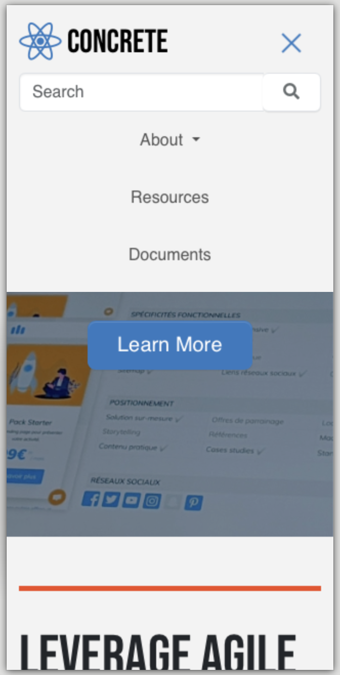
If you click ‘About’ the dropdown will collapse down to reveal the child pages , however, when you click ‘About’ again to close it back up it stays open.
Tapping “About” when the submenu is open shouldn’t close it; it should take you to /about. Are you seeing the same issue on this fresh install?
https://dtest-3y86-uoia.plskyline1.concreteserver.com/index.php
That is exactly what it is doing for me but I was hoping for a simple solution for the ‘About’ dropdown to collapse when clicked but then close back up when clicked again. So reveal and unreveal. Currently my site has several dropdown menus and so without the option to open and close each of the dropdowns you start getting a long page list which is an issue on a small mobile screen.
I think it’s theme dependent, so you’d want to pick a theme that supports that or build it yourself. For example, the Elemental theme will toggle between subpages in mobile (although it doesn’t close by tapping again): https://dtest-3y86-uoia.plskyline1.concreteserver.com
it’s the same test site as above, but I just switched to Elemental and changed the nav block to Auto-Nav.
Thanks for your help with this. I will have a look at the old autonav template. Otherwise, I may just look at using mega menu which to be honest is a bit overkill for my requirements. I used to use the Zurb Foundation framework and used autonav with the foundation navigation bar which worked really well, but since moving over to using bedrock and bootstrap I have found the navigation options limited.
I suspect the limitation arises from ‘Mobile First’. A necessary consideration nowadays.
Ironically, it doesn’t work that well on the mobile by not giving the end user the option of revealing and closing back up the various page dropdowns in a limited viewing area.
It could just be an oversight. I’d think that, at minimum, the open submenus should toggle state, or at least have the option to set that behavior. And if the link_to_first_child attribute is set on the parent page, I’d think a nice default behavior would be to toggle the submenu. Maybe make an issue in GitHub because the behavior you describe is what currently happens in the desktop version.
Thanks again. I will add it to the nice to have on GitHub. I normally use the link_to_first_child attribute for dropdowns. It must be fairly straightforward to implement as this example demonstrates. It uses click actions rather than hover which seems to be the issue.
It appears I have solved the issue by changing the navigation frontend js. Is there a way of overriding the frontend navigation js without touching the core’s file? Unless I am missing where I could do this.
I believe you do it the same as any other override. Put your modified JS file in /application/js/features/navigation/frontend.js (IF that’s the frontend.js file you tweaked. There’s a bunch of them)
Thank you for this advice. It appears to have worked for me.