I am coming up on this from testing v9b2, but my thoughts are really about Bootstrap5.
The general button and alert colours in Bootstrap have been strengthened, presumably for high contrast and discrimination to satisfy ARIA.
While I find the Bootstrap5 default colours a bit like a 5-year old child’s school paintings, I can live with that.
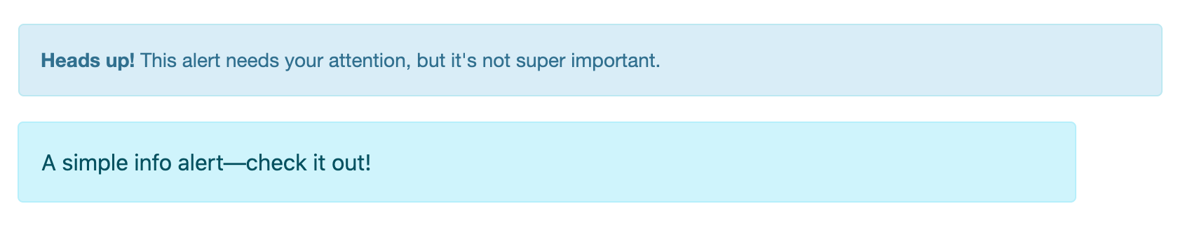
Except for ‘Info’. Info used to be calm and innocuous, ideal for general information to help users along. Now it jumps off the page more strongly than success, primary or warning and is on a par with danger.
Does anyone else find the new ‘info’ colour scheme for buttons and alerts a little psychedelic and violent on the eyes?
I hope the next iteration of Bootstrap tones ‘info’ down a little.
Yeah, it’s interesting because even in the sample text they seem to be indicating the intention is to make it more urgent-seeming - their idea is more that “it’s not super important” for v3, but then by v5 there’s not mincing words there, just “check it out!”.
In that regard, if it’s their intent to make it more pizazz-y to grab a hair more attention, I think they succeeded. Comparing it to the v3 version definitely makes it seem a little “hey, easy on the lapels there” but taken by itself in amongst the v5 palette it’s reasonable-looking for the intended purpose, if a little bright - hopefully no one writes an essay in it.
v3 colors are nice, v5 colors are awful, they’re like web is back to 90’s. My c8 packages look ugly in c9 because of the colors - tons of modifications will be required.
Controversial opinion, but I don’t like the heavy and increasing reliance on Bootstrap in CCMS full stop, my personal feelings are that PL should build their own CSS framework for use in the backend, I know this would be a huge task, but it wouldn’t require major re-writes every time a new version is released, visuals can be updated without class changes etc. Nothing to stop them from putting in helpers etc for devs that choose to use Bootstrap, but the heavy reliance on a completely independent 3rd party does concern me, especially when its such an integral part of the CMS.
I think I agreed with you here. I do like using Bootstrap 5 in theme development. But using it for the system pages seems like you are at the mercy of Bootstrap anytime a new version comes out.
Great improvement to ‘info’ in the released v9 dashboard.
The more muted colour of the alert-info is much easier on the eyes and the deeper colour of the info button is both easier on the eyes and clearly distinguishable next to a primary button.
Such small changes to the dashboard theme make a great difference.
I use WAVE plugin for Chrome for accessibility testing. It’s become apparent that to pass accessibility buttons are going to have to have seemingly crazy contrast. I tested another site we did and it failed even though the contrast seems very good. I know this is what some users require, but for the rest of us it’s too much. Just wrote a proposal for a new site where they want to pass as many accessibility requirements as possible so I have proposed a button or switch and we’ll switch the theme between “normal” and “high contrast” for maximum accessibility.