I have ran into a snag regarding layouts in containers ( bootstrap 5). When I create the container I have 5 columns, they are not equal in size, and the adjustment tabs allow me to change the size but in large increments. How do I make fine width adjustments so that the columns are the same width?
I found that if I create a new container and define it with 6 columns the result is even, but I have one extra block that throws off the visual and wastes space.
Bootstrap (and many other theme frameworks) are based on a 12-column grid. 12 divides evenly into 2,3,4,6, but not into 5.
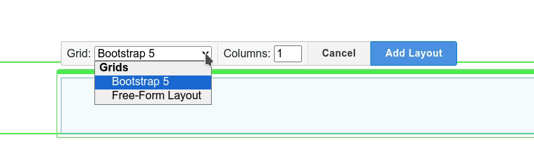
Depending on core version and theme, you may be able to declare a ‘freeform’ layout which divides the area exactly rather than by using the theme grid.
Failing that, the quickest work round is to have an empty single grid column to either side, so 1.2.2.2.2.2.1 = 12, or to use 6 columns and ignore the right-most.