I am in the process of updating an addon’s dashboard pages for v9 compatibility. I have 2 screens side by side, one open on v8, the other open on v9. Both on the same dashboard page.
My wife peers over my shoulder and asks what I am doing. After I have explained she remarks “I like that, it’s so much clearer”.
Trouble is, she was looking at the v8 screen.
With this accidental 3rd party test in mind, has there been any 3rd party ‘blind’ test and comparison of the v9 dashboard theme against the v8 dashboard theme? Has anyone presented it to customers with no prior experience of Concrete and simply asked “Which do you find easier to read?”
To be absolutely clear, this is not a question about v9 functionality. Just the dashboard theme.
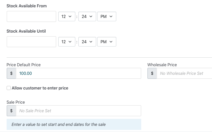
My guess here is that your wife’s comment was primarily because field borders use a very light grey, and it’s just not quite enough contrast with the white background.
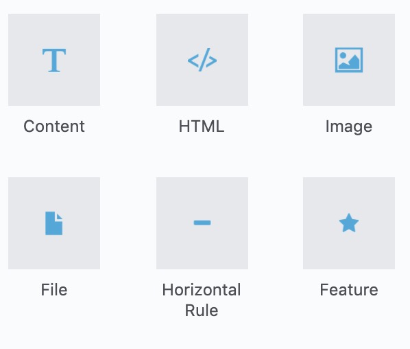
From an accessibility view point I do find the block icons blue color difficult to see on the medium grey background. Personally I would recommend using a darker color to create a better contrast.
I have used C5 for years and hate to criticize but the spacing/padding text color & text sizing could do with some refinement. I have attached the current and a small tweaked version of how I would override the current styles.
These are only suggestions. I am sure the core team are busy focussing on functionality and the lovely new features but the Dashboard UI does need refining and polishing. These are generally small CSS adjustments but it would make the UI more user friendly and less screen space hungry.
@jessicadunbar - That docs page is largely about reporting technical issues, such as a button that has pull-left instead of float-start class.
This thread is more about aesthetics and usability, so not a simple yes/no technical issue.
If a developer submitted a pull request for a clear technical issue (correcting an obsolete pull-left to a float-start), then it would likely be approved and so the work involved would be worthwhile.
But a pull request putting considerable work into changing the spacing/padding throughout the dashboard theme would likely be wasted work unless the nature of the changes were discussed and agreed with the core team beforehand.
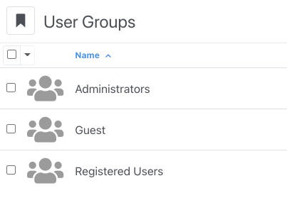
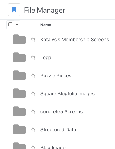
Finding the use of large icons in lists unhelpful - the distinguishing element in the list is the name, having a repeating huge icon is a distraction where it doesn’t add meaning…
I think much of the lesson here is just because we have bootstrap beneath the dashboard theme doesn’t mean it has to be implemented in vanilla bootstrap.
We don’t have a vanilla bootstrap front end theme because it would look yuk. Design work was put into Atomik.
So why not put some design work into the v9 dashboard theme and get it away from vanilla bootstrap. Give the dashboard a concreteCMS identity rather than a vanilla bootstrap identity.
I think contrast should be improved in places, but I’m one of those people that doesn’t really dark backgrounds on interfaces. I nearly always prefer lighter backgrounds, just as long as the text on top has the right amount of contrast.
The contrast of the block names on the add block panel is better contrasting in V9, versus V8, where I’ve thought the text label is too dark a grey. It’s perhaps the icons that are less contrasting. That might come down to whether you tend to look for interface elements by text or by icon/shape. (both are important though, anyone seen the mess that cPanel put out lately by trying to pitch not having any icons?!)
I often wonder if people sit in dark rooms with their monitors cranked up to the brightness of a thousand suns, and then wonder why their eyes hurt with lighter interfaces…