レスポンシブで表示画像を変える、
例えば、PCなら101.jpg、モバイルなら102.jpgを表示させたい。
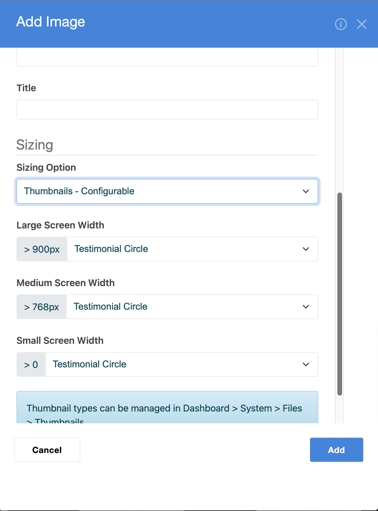
そのような方法、ブロックはありますか?
Block Builder のアドオンを入れてみましたが、その様な設定、
項目は見つけられませんでした。
Thanks for the reply.
I may be mistaken,
It seems to me that the method you have presented changes the size of the image but does not automatically switch the image file itself.
Check out @Myq’s initial advice about css breakpoints, you will be able to display different images using this technique.
Sorry, you’re right. I didn’t look closely enough! You can definitely do it with CSS breakpoints though.