The sites necessarily have their own specific purpose and navigation, but does it need to be so hard to navigate between the sites? To at least get some consistency, can we have one common menu dropdown section, repeated on all sites with the same links and labels in the same order:
A link to each community site
A link to the get concrete/download page
A link to send messages
Some challenges for the folks at Portland labs responsible for the menus (and for @frz’s Mom):
Go to the marketplace site. Using nothing but the main navigation bar, navigate through the sites and download a copy of the latest concrete core.
Go to the forums site. Using nothing but the main navigation bar, navigate to a page where you can send a Concrete Private Message to someone who posted.
I am sure there are more site navigation paths that are hopelessly obfuscated or impossible, or where it is obvious to go one way, but impossible to get back again. The above are a couple of examples that should be simple, but are not. We need a general and obvious to users solution for between site navigation.
I totally agree. The two URLs should urgently be harmonized. Large international companies turn back to one single harmonized URL’s instead of many country sites.
I wasn’t able to get what I wanted, I endend up in many mouse trips in various navigations.
…If you can’t captivate a possible user in minutes, you’ve lost. Goes also well with the truism “You never have a second chance to give your first impression”, meaning, that once you are turned off by the complication/difficulty you’re off, somewhere else.
I couldn’t agree more! Sometimes when clicking around the cache causes issues where it says I am already logged in but can’t see anything or navigate anywhere. Especially annoying is when a simple click goes to yet another login page… Agree - why does it have to be so difficult?
I do think these sites deserve to have unique navigations as they serve unique problems.
That said, I do agree it’s not easy to get around between them.
Something I’d add to this concern that I’m surprised hasn’t been mentioned yet is our mobile nav - which is garbage. As we think about ways to make it easier to get around, we should absolutely revisit the mobile nav too.
I don’t think this is a cache issue. What may be happening here is you’re being automatically logged into a new site, but the page you’re accessing is something you don’t have access to. Instead of saying so, we say “you’re already logged in” because of annoying edge cases. We’ve got a ticket to make that better.
yeah, that particular flow is kind of intentional because that’s the commercial site. From the open source site (.org), there’s a link to download at the bottom of the homepage.
You can get to the open source site from the commercial site by selecting Why Concrete? > Open Source then following the link to the open source site.
Not disregarding any of the other comments about shortcomings of the cross-site navigation, though. Just pointing out that there is an intentional difference between the experience on .com vs .org similar to how competitors (ahem, WP) do it…
That is the essence of the problem. Amongst all the stuff on an open source project web site, surely a clear and easy to find download is one of the most important, so why is it obscurely at the bottom of a page?
If you look at most open source project websites, they have a clear “Get” or “Download” button in the header. That doesn’t necessarily download directly, but will always take you straight to somewhere that does. Same with links to a GitHub page to encourage participation and provide another way to download.
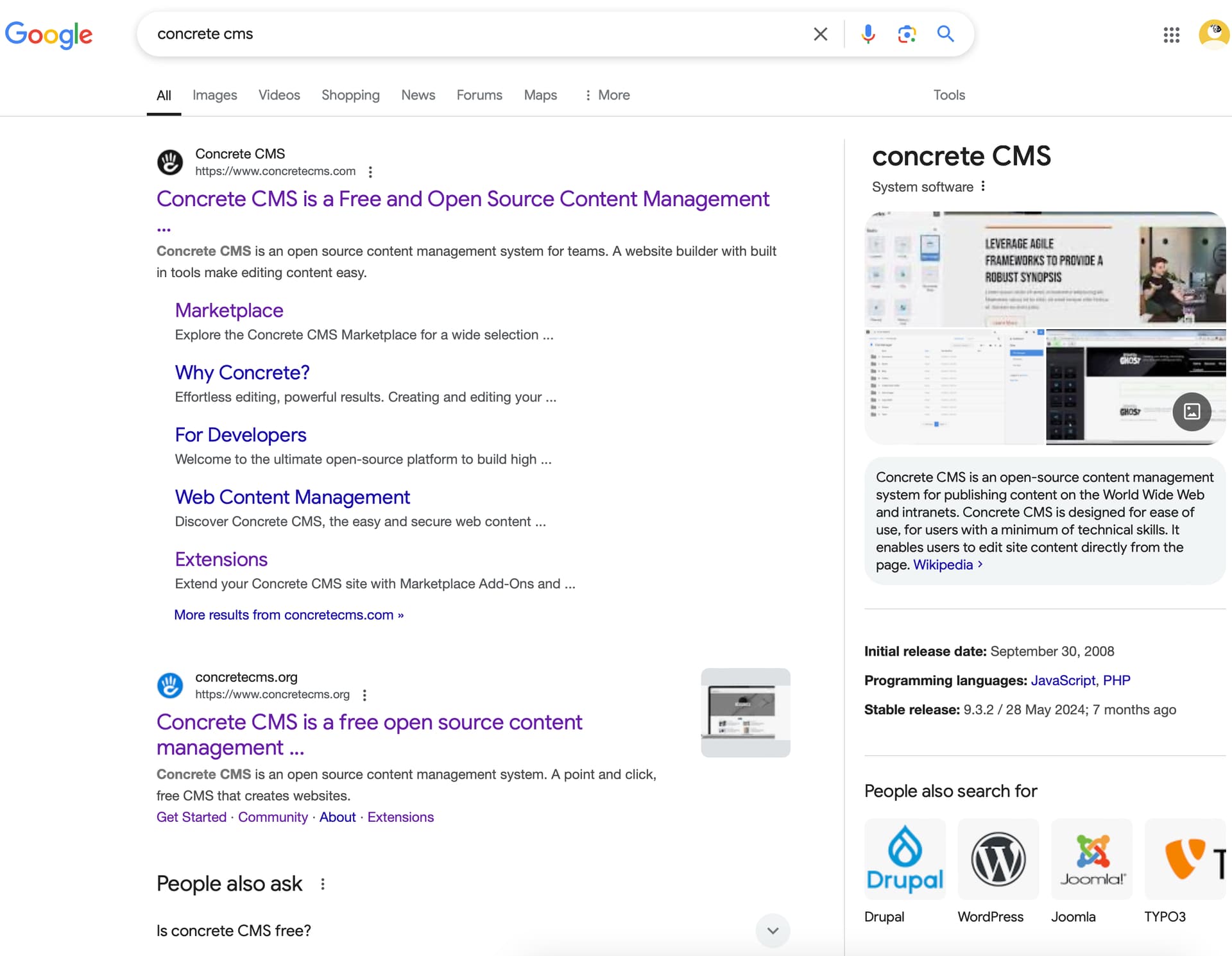
The issue is, if you Google ‘Concrete CMS’ for me, the .com website appears as the first main link to the CMS. On this page there is a ‘get started’ option to the hosted version but there should be a download link also.
There’s a path to get from the commercial site (.com) to the open source site (.org), unlike the commercial sites (and first links in Google searches) of some other CMSs (ahem, WP).
Also, my search results are pretty clear that you can download a free copy:
For people who want someone to handle the details and don’t want to get into the weeds, they might have the opposite observation if the situation were reversed. They might get the open source site and wonder why anyone would want to download all this software when they just want to build a website…
@Myq, Developers submitting addons to the marketplace are leaving them as files uploaded, but not actually submitted for review. I went looking to see if I could advise and couldn’t even find a link to ‘submit a new addon/theme’ from the marketplace pages (I can only find a link from the main .com site)
Please add some guidance for developers on the submission process, specifically on actually submitting an upload for review.
Surely there should be a navigation link from the marketplace sub-site to the submit page.
Hi
As one of the newest concretecms newbies, I was initially confused by this split, but it was not the now more understandable split (com/org) itself, but the technical interweaving as it currently exists. When I go to .com I select the documentation and end up on .org. If I choose the extensions I get .com.
I think it’s worth taking a look at these links for usability. I am convinced that a good solution will be found with longterm users and you. because I personally think it is good that an opensource has a community part and a commercial aspect with .com. After all, everyone here uses concretecms not (just) for fun, but for one or more purposes.
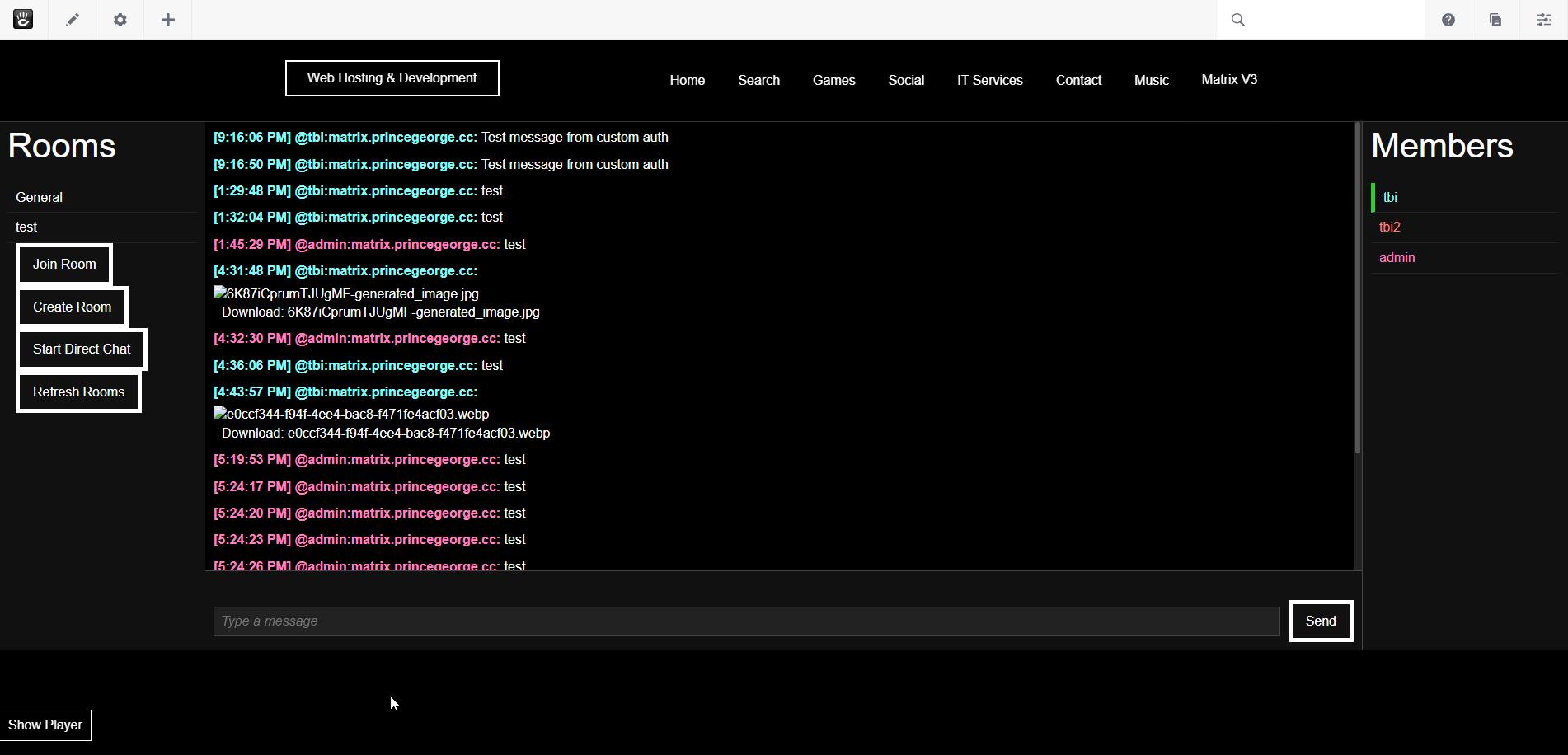
I just came here too say I have been working on a Matrix Synapse / Concrete CMS integration that basically adds social media website functionalities with all the capabilities of discord too a ConcreteCMS version 9 website.
you can even Authenticate too the matrix server using your Concretecms Account, and federate different websites/matrix servers together so users can go in-between.
I find it absolutely disgusting that we can’t have one ConcreteCMS Website too rule them all…
PS: the new marketplace kinda sucks, do you people like need an intern?
(I should skin that thing too look like winmx from back in the day)